

S&C Design System: Example App Error Flow

Founded in 1911, S&C Electric Company is Chicago's second-largest manufacturer with a global team of 3,500. They are a leading provider of equipment and services for electric power systems. S&C's products combine hardwares and softwares, enabling remote control of devices like transformers.
I joined their Design System team as a UI/UX Intern, under the UX/Technology Management division in Summer 2023.
My Role
UI/UX Design Intern
Duration
Jun 2023- Sep 2023
Team of 9
Deliverables
Stakeholder interviews
Lo-fi Wireframe
Hi-fi prototype
User Research
Comparative Analysis
Design reviews
Sprint Demo
Mid-term Report
Executive presentations
Hands off documentation
Tools
Figma
Bitbucket
Balsamiq
Jira
Confluence
Atlassian
Microsoft Teams
Slack
React Native
1 UX Designer
2 UI/UX Intern
4 Developers
1 UX Strategist
1 Project Manager
Impact
-
Expecting to boost the adoption rate of error flow-related components, with the anticipation that they will be implemented across all S&C mobile apps.
-
Provided the engineering team with well-crafted design proposals for testing and fixing defects ahead of releases
-
Ensured consistency across the apps, and successfully gained stakeholder buy-in.
METHODOLOGY
Agile development
Following the Agile development model, our development process is structured into 10 two-week sprints. Each sprint includes twice-weekly design reviews, daily scrum meetings, biweekly demos, and a retrospective at the end.
Double Diamond
Our innovation process followed the Double Diamond model, starting with discovery, research, and defining the problem, then moving on to designing, testing, and delivering the solution

WORK PROCESS STARTED
Context
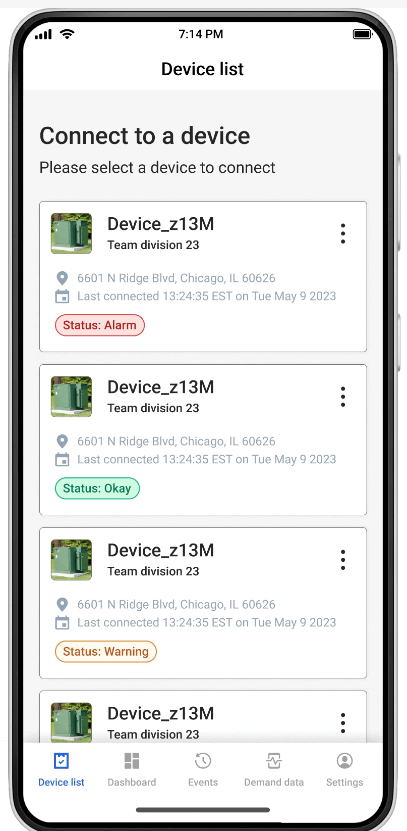
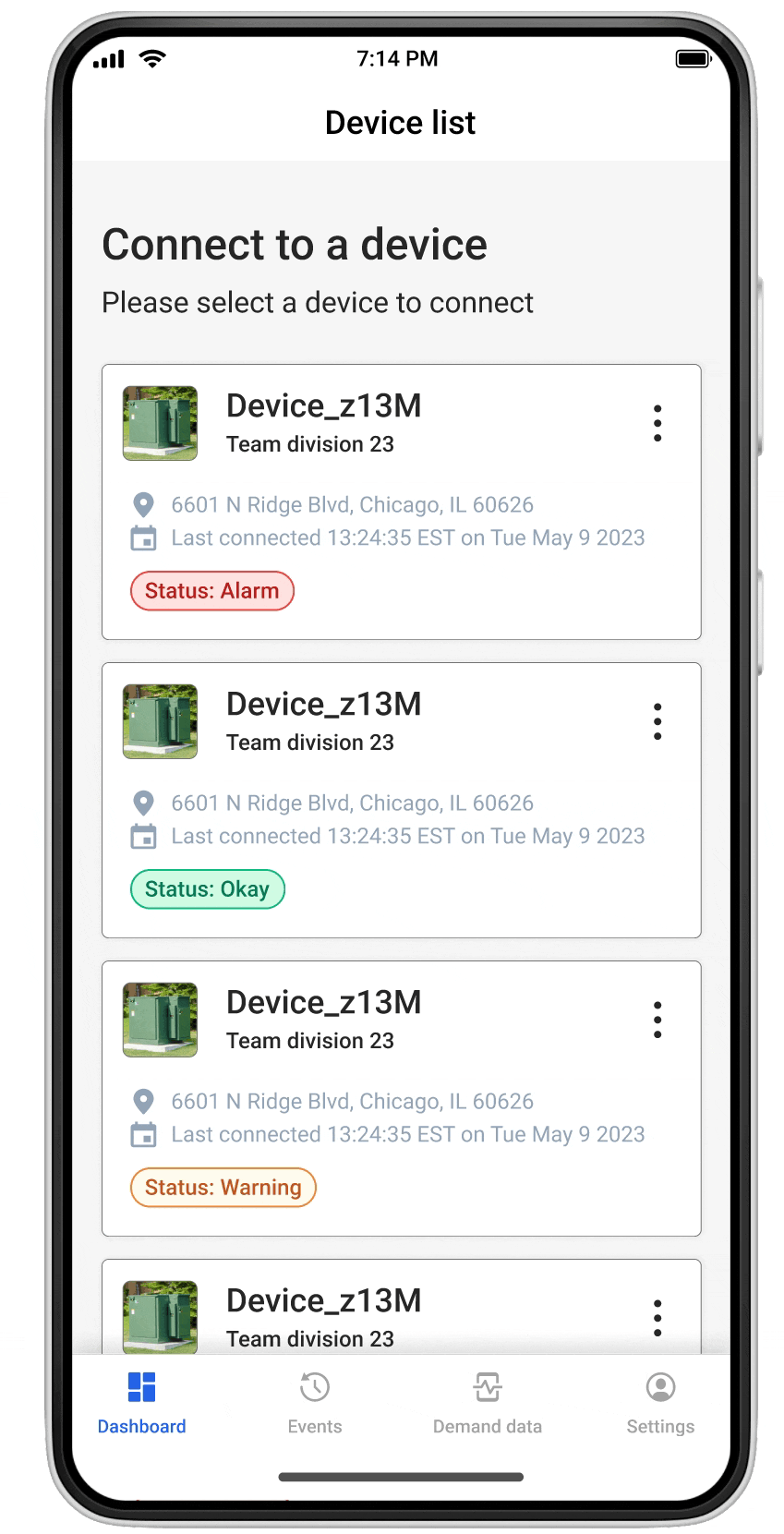
S&C's design system team has been working on the Example app, it is an internal full stack mobile application that realistically reflects how our mobile components are being used while allowing us to design UX patterns to be used across all S&C mobile apps.
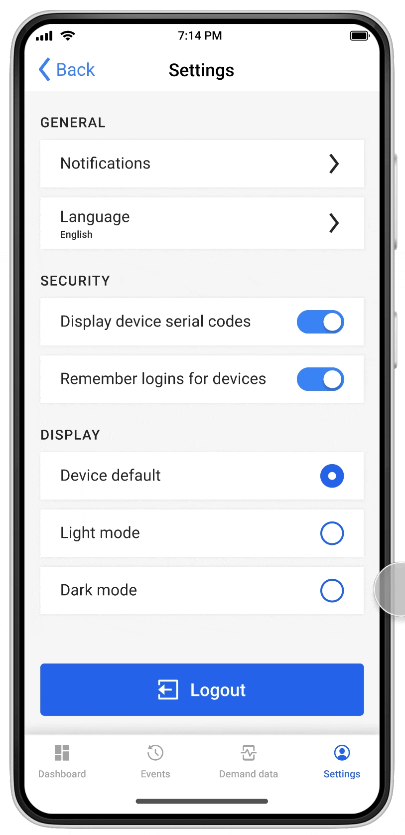
It's a collection of features rather than a step-by-step flow. Our well-designed collection includes onboarding, login, device connection, device addition, dashboard, and settings, etc.
Problem
Our current UX patterns mainly focus on the happy path, but users can also face errors. However, these situations aren't fully addressed in the current flow.
Goals
Develop and design the error flow for the example mobile app.
Activities and outputs
RESEARCH - UNDERSTANDING USERS AND KEY SCENARIOS
Challenge
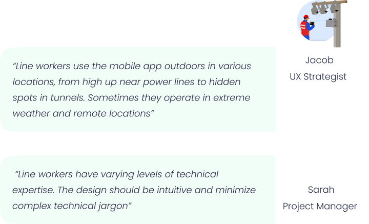
Line workers are our primary users. However, due to confidentiality, we lacked direct access to user statistics and couldn't direct interact with them.
To understand our users without direct data, I…
-
Engaged in detailed discussions with UX strategists who had insights from line workers.
-
Reviewed user interview documentation on Atlassian from other products targeting similar user groups.
-
Conducted secondary research to understand common scenarios faced by line workers.
These approaches deepened my understanding of the user group and the key features they use in S&C mobile apps.
Key pain points:
Activities and outputs

DEFINE STAGE
Gaining an understanding of the user base greatly aided me in thoroughly grasping the existing example mobile app product. Now, I can confidently collaborate with the lead designer to audit the current screens.
Key Existing Scenarios:
-
Users sign in with administrator credentials.
-
Users activate Bluetooth to search for nearby devices.
-
Users can connect or disconnect devices.
-
Users modify settings as needed.
-
Users access the dashboard for information.
-
Users enter device details.
-
Users review weekly events.
HMW
As I explore potential errors users might encounter, I need to address this key question before sketching:
How might we design a seamless method for users to recover from errors and return to a positive experience?
Competitive analysis
By answering this question, I proceeded to conduct a competitive analysis. I examined 40 error screens from Airbnb, Ebay and Instagram to examine their insights and design solutions for error process design.
Based on the analysis, I summarized a common key approach findings from competitors that we can apply when designing error screens of the example mobile apps.
Identified Error scenarios
-
Unintended Deletion" error
-
Forgot password flow
-
Empty states
-
Server error
-
Network error
-
"End-of-Page Notification" error
-
“ Unintended logout” error
Define - Design Principles when design error flow
-
Place error messages in centralized pop-ups or above the indicator bar for scrolling screens.
-
Use clear error messages: there are three crucial pieces of information error messages need to convey: the description that explains the issue, the cause and offer solutions or guidance to the user.
-
Including buttons or icons that allow users to take specific actions, such as retrying, refreshing, or navigating back to the app.
-
Using visual cues, such as red strokes or borders, exclamation marks, or icons, to highlight errors and attract user attention.
Activities and outputs

DESIGN STAGE
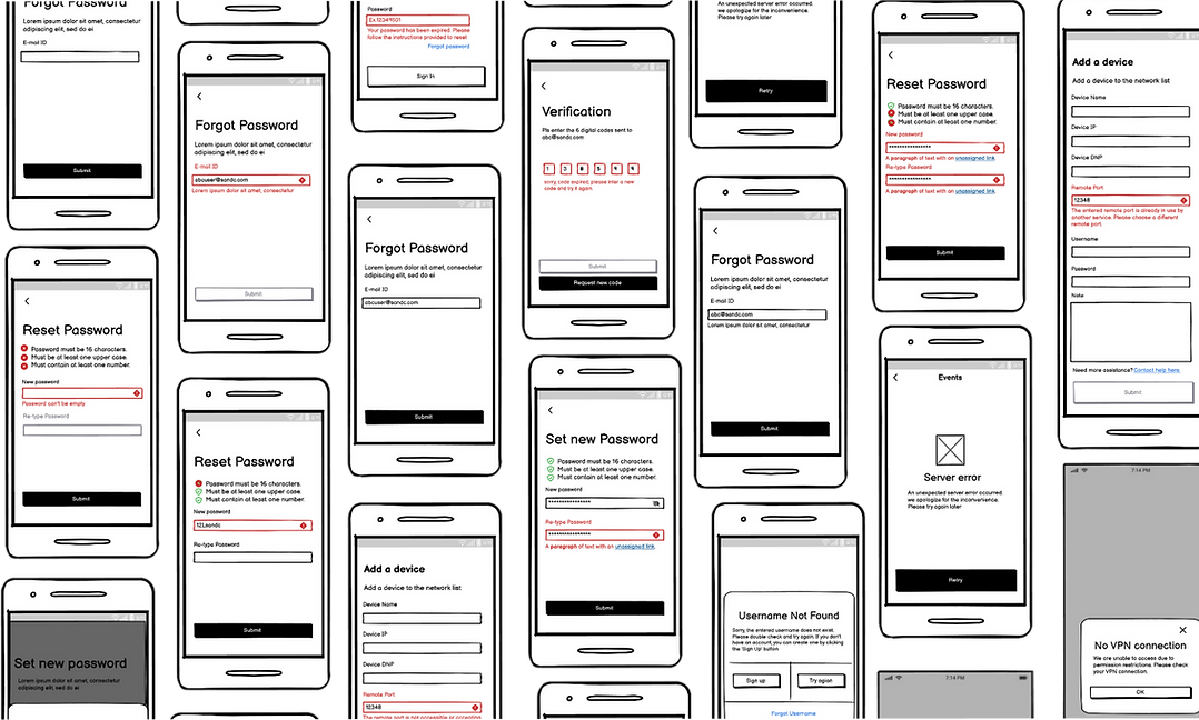
Armed with an understanding of pain points and fundamental design principles, we proceed to the low-fidelity (lo-fi) stage. For this, I utilized Balsamiq to outline my initial draft ideas for each flow. This process helped me in visualizing my design ideas and also facilitated a smoother transition to the following high-fidelity stage.
Lo-Fi Design
Activities and outputs
Proposed Hi-Fi Design
PROTOTYPE
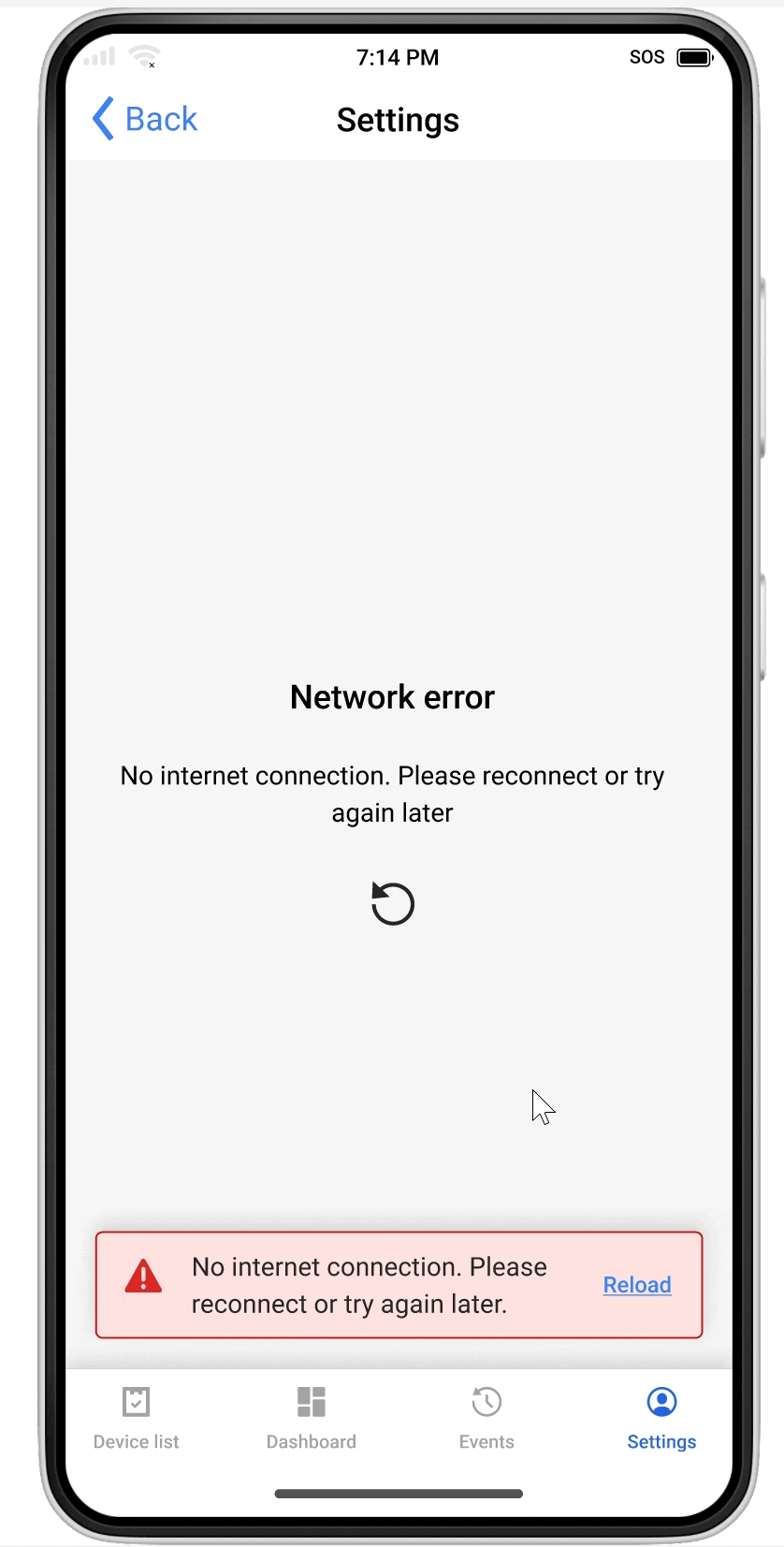
Network Error
Internet connection errors are common and can occur on any page.
This notification is displayed when users are in airplane mode or temporarily lose network connection.
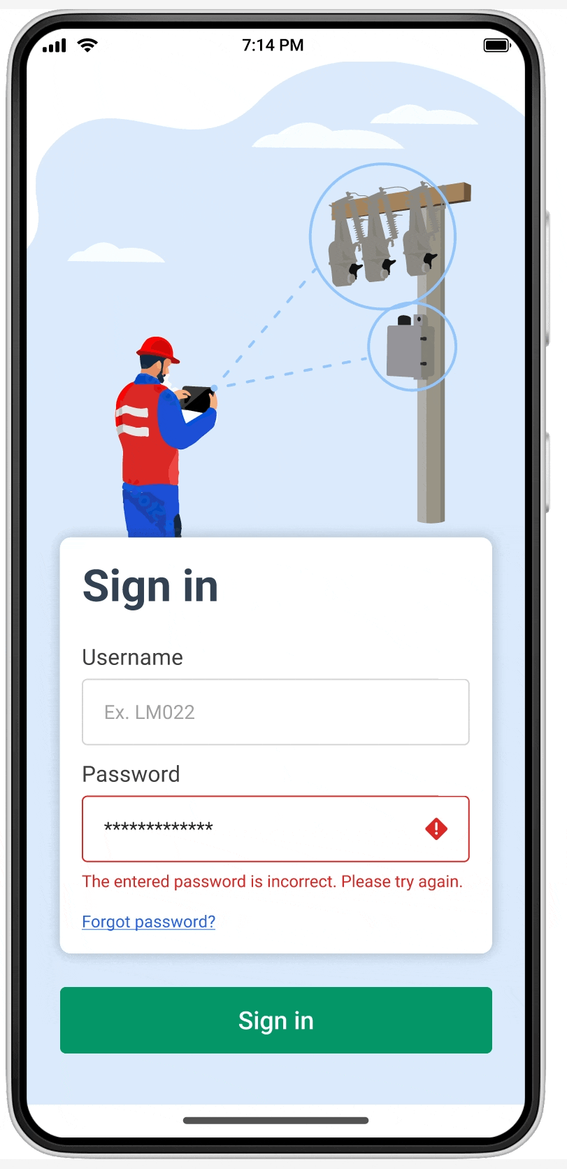
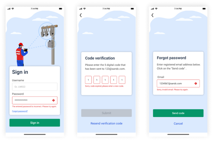
Forgot Password
part 1
KEY SCREENS
Possible error scenarios here include:
•Entering an invalid email
•Using an expired verification code
PROTOTYPE
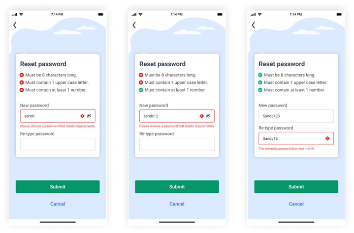
Forgot Password
part 2 Reset password
KEY SCREENS
•The reset password not meeting the requirements
•The retyped password not matching the original.
PROTOTYPE
Activities and outputs

PROTOTYPE
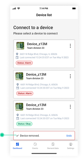
Unintended deletion
Unintended deletion errors occur when a user accidentally deletes a device card.To prevent this, I've designed an "undo" feature.
PROTOTYPE
Empty State
Empty states occur when users first land on the app, and they haven't connected any devices yet.
This results in nothing to display on pages like the dashboard, event page, and demand data page.
PROTOTYPE
404 Server Error
This error screen occurs when something goes wrong with internal server or app crash down.
PROTOTYPE
Unintended logout
Creating a pop-up window that includes a "Cancel" option. This way, users who are not ready to log out can prevent it from happening accidentally.
Test- Iterate
In a pivotal design review meeting, I presented my high-fidelity prototype to the team including developers, the design lead, a UX strategist, and the project manager. This collaborative session was for testing the flow and gathering diverse feedback. Utilizing these insights, I made a few iterations.
Unintended logout
FEEDBACK

BEFORE

AFTER
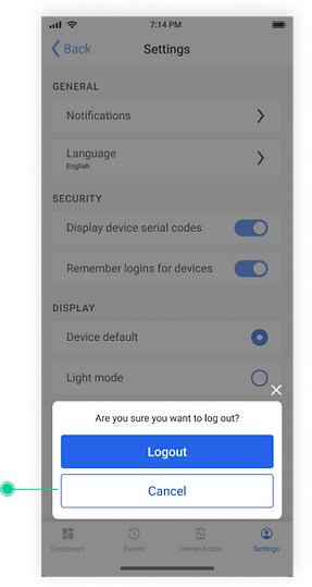
AFTER-PROTOTYPE
Unintended deletion "undo" feature
FEEDBACK
BEFORE
AFTER
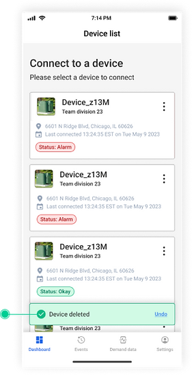
AFTER-PROTOTYPE
Activities and outputs
After incorporating feedback from testing, I transformed the final design into a PowerPoint presentation, meticulously preparing it with three mock-up sessions with the team. This was then formally presented at a report-out meeting for the entire organization, attended by 50 participants.
Conclusion
Next steps
-
Document each screen on Confluence to ensure comprehensive record-keeping and provide a clear reference for the handoff process.
-
Hand off the design to developers for implementation using React Native, ensuring the technical build aligns with the design vision.
-
Collaborate closely with developers on Bitbucket, during the development of the approved error flow, to maintain design integrity.
Growth
My proficiency in Figma has significantly and markedly improved.
Thanks to several workshops conducted by our design lead. These sessions focused on advanced features like designing component sets, using auto-layout for responsive design, and data visualization. Applying these skills in my projects has been instrumental in my development.
My collaboration skills with Confluence, Bitbucket, and Jira.
Working with our cross-functional team, I've learned crucial documentation skills. Using Confluence, we've enabled clear, accessible team discussions and created a reliable record of our decisions. Additionally, managing tasks on Jira has streamlined my prioritization and efficiency.
Bi-weekly design reviews have sharpened my skills in presenting design ideas.
Bi-weekly design review meetings have been invaluable; presenting my work and learning from senior designers has honed my skills, and early developer involvement has reduced extensive changes, enhancing our work quality.
Recommendation


Thank you to my wonderful team! I had one of the most rewarding intern experiences during the summer of 2023.
